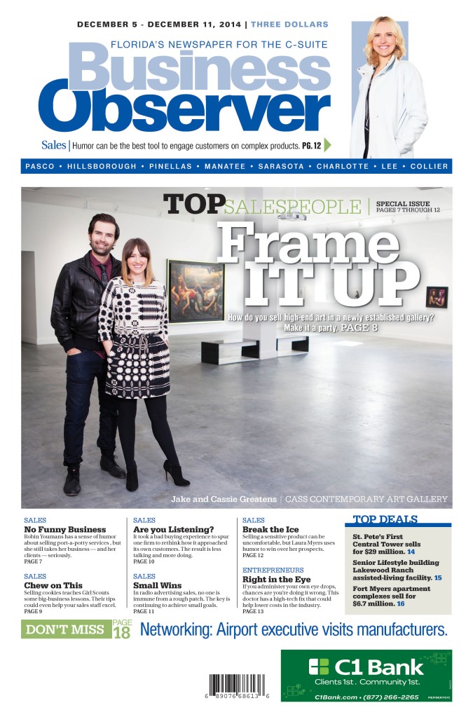
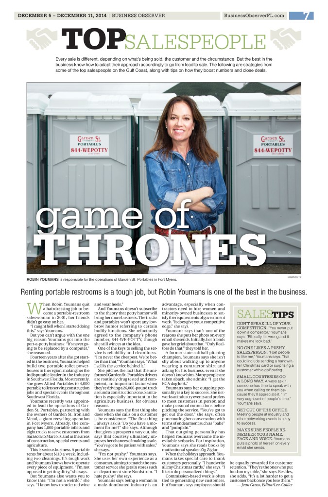
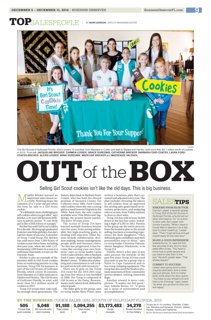
This week’s issue of the Business Observer had a special theme – top salespeople. Whenever we run these special issues, I create a unique logo or style to signify that the issue is different from our typical week-to-week coverage. My goal is for the style to be content-driven, without being cheesy. For last year’s top salespeople issue, I incorporated a very simple handshake illustration. A little gimmicky, I only used that on the intro page this year, instead focusing on type. I emphasized the word “top” in a heavier, black type, since that’s the important part of the phrase – these are the top people, the best. The word salespeople was more subtle and in green, to evoke the idea of money. I reformed this logo throughout the paper to make the section cohesive.
Read that last story on selling Girl Scout cookies here.
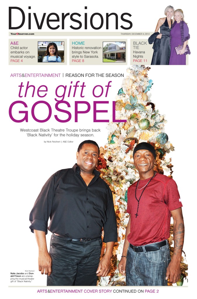
For our A&E cover story, the main art had an ugly background. The subjects were in the backstage area of a theater. Not much you can do to make that pretty. However, they were standing by a Christmas tree, which was relevant to the story. So I drew the focus to the subjects and the tree by cutting them out and removing the background.
Read the story here.


